Bootstrap and Parcel

What is Parcel?
Parcel is a web application bundler designed to simplify development with zero-configuration defaults. It supports the TypeScript and TSX files used by Idea React.
Setup
This guide starts a Parcel project from scratch. Install Node.js and use a terminal to create the project directory and initialize its package manifest:
mkdir my-project
cd my-project
pnpm init
Add Parcel and its TypeScript transformer as development dependencies, then install Idea React and its peer dependencies:
pnpm add -D parcel @parcel/config-default @parcel/transformer-typescript-tsc typescript
pnpm add idea-react@next react react-dom mobx mobx-react
Use idea-react without @next after a stable release.
Project structure
Create the HTML entry point, a TSX module, and the Parcel and TypeScript configuration files:
my-project/
├── .parcelrc
├── package.json
├── tsconfig.json
└── src/
    ├── index.html
    └── main.tsx
Configure Parcel
Parcel can serve an HTML entry directly. Its TypeScript transformer compiles TS and TSX, including the standard stage-3 decorators used by MobX.
Configure .parcelrc to use the TypeScript compiler transformer:
{
    "extends": "@parcel/config-default",
    "transformers": {
        "*.{ts,tsx}": ["@parcel/transformer-typescript-tsc"]
    }
}
Set TypeScript to emit automatic React JSX and preserve standard class-field semantics in
tsconfig.json:
{
    "compilerOptions": {
        "target": "ES2020",
        "module": "ES2020",
        "moduleResolution": "bundler",
        "useDefineForClassFields": true,
        "jsx": "react-jsx"
    }
}
useDefineForClassFields preserves the field semantics required by MobX's stage-3 decorators.
For the complete set of repository options.
Point Parcel to the HTML entry in package.json and add development and production scripts:
{
    "source": "src/index.html",
    "scripts": {
        "dev": "parcel --open",
        "build": "parcel build --public-url ."
    }
}
In src/index.html, provide a mount point and the Bootstrap, Bootstrap Icons, and Idea React
stylesheets:
<!doctype html>
<html lang="en">
    <head>
        <meta charset="utf-8" />
        <meta name="viewport" content="width=device-width, initial-scale=1" />
        <title>Idea React with Parcel</title>
        <link
            rel="stylesheet"
            href="https://unpkg.com/bootstrap@6.0.0-alpha.1/dist/css/bootstrap.min.css"
        />
        <link
            rel="stylesheet"
            href="https://unpkg.com/bootstrap-icons@1.13.2/font/bootstrap-icons.css"
        />
        <link rel="stylesheet" href="https://unpkg.com/idea-react@next/dist/index.css" />
    </head>
    <body>
        <div id="root"></div>
        <script type="module" src="./main.tsx"></script>
    </body>
</html>
Start the development server and create a static build with:
pnpm dev
pnpm build
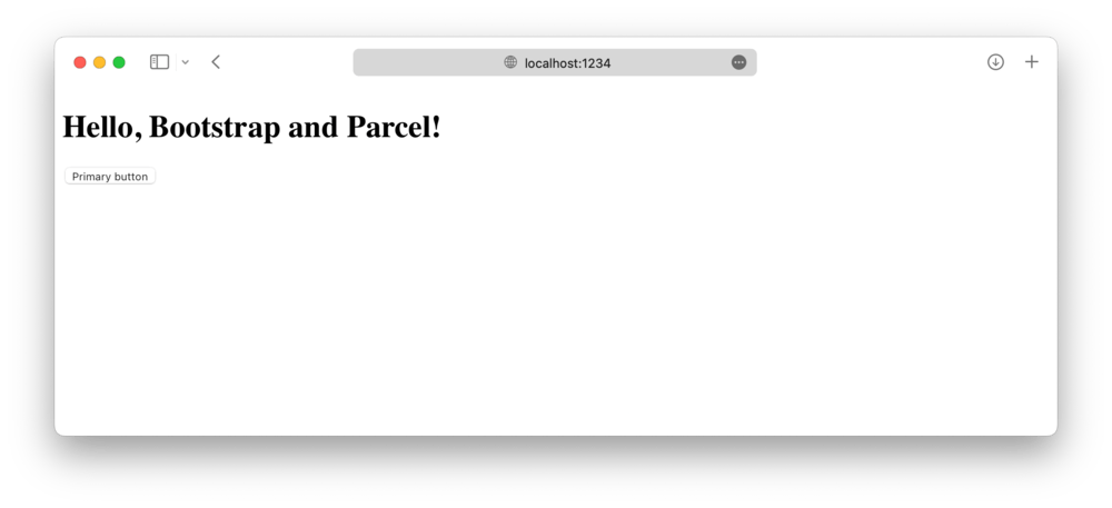
Import Bootstrap
The CDN links above provide the compiled component styles. Import Idea
React from its public package entry point in src/main.tsx:
import { createRoot } from 'react-dom/client';
import { Button } from 'idea-react';

createRoot(document.getElementById('root')!).render(
    <Button variant="solid" theme="primary">
        Hello, Idea React and Parcel!
    </Button>
);
Idea React's React components provide their own behavior, so importing Bootstrap's JavaScript bundle is unnecessary.
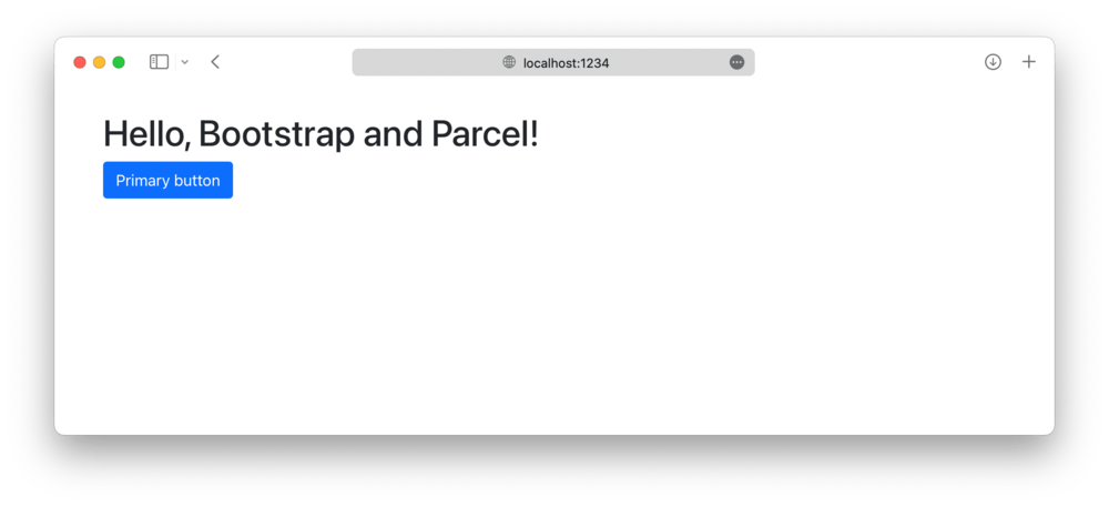
For a ready-to-use project scaffold, clone the React, MobX, and Bootstrap template and adapt it to your application:
cd my-project
git init
pnpx git-utility download https://github.com/idea2app/React-MobX-Bootstrap-ts master
pnpm install